Date
2025
Client
GoNanas
GoNanas
TURNING UP THE DIAL
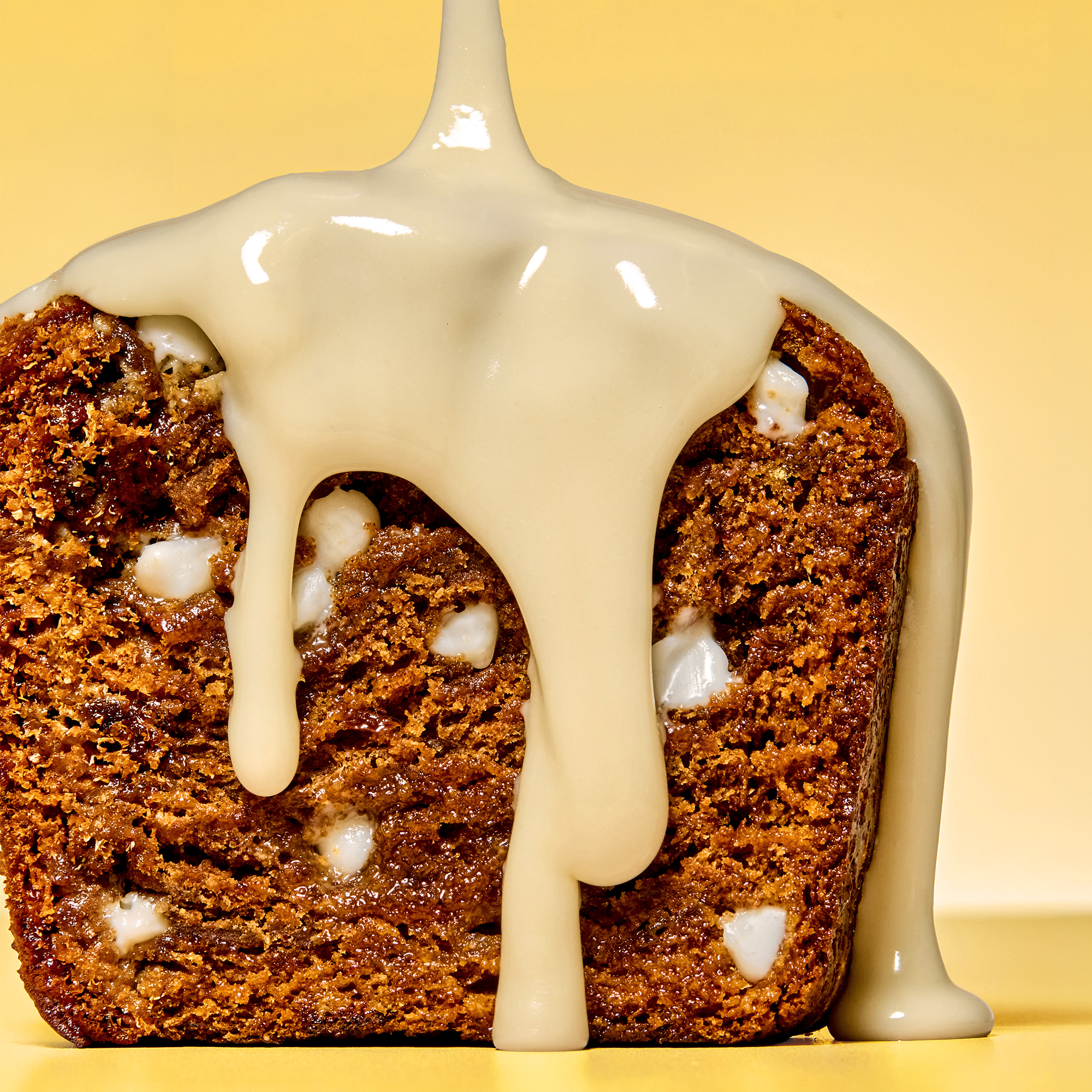
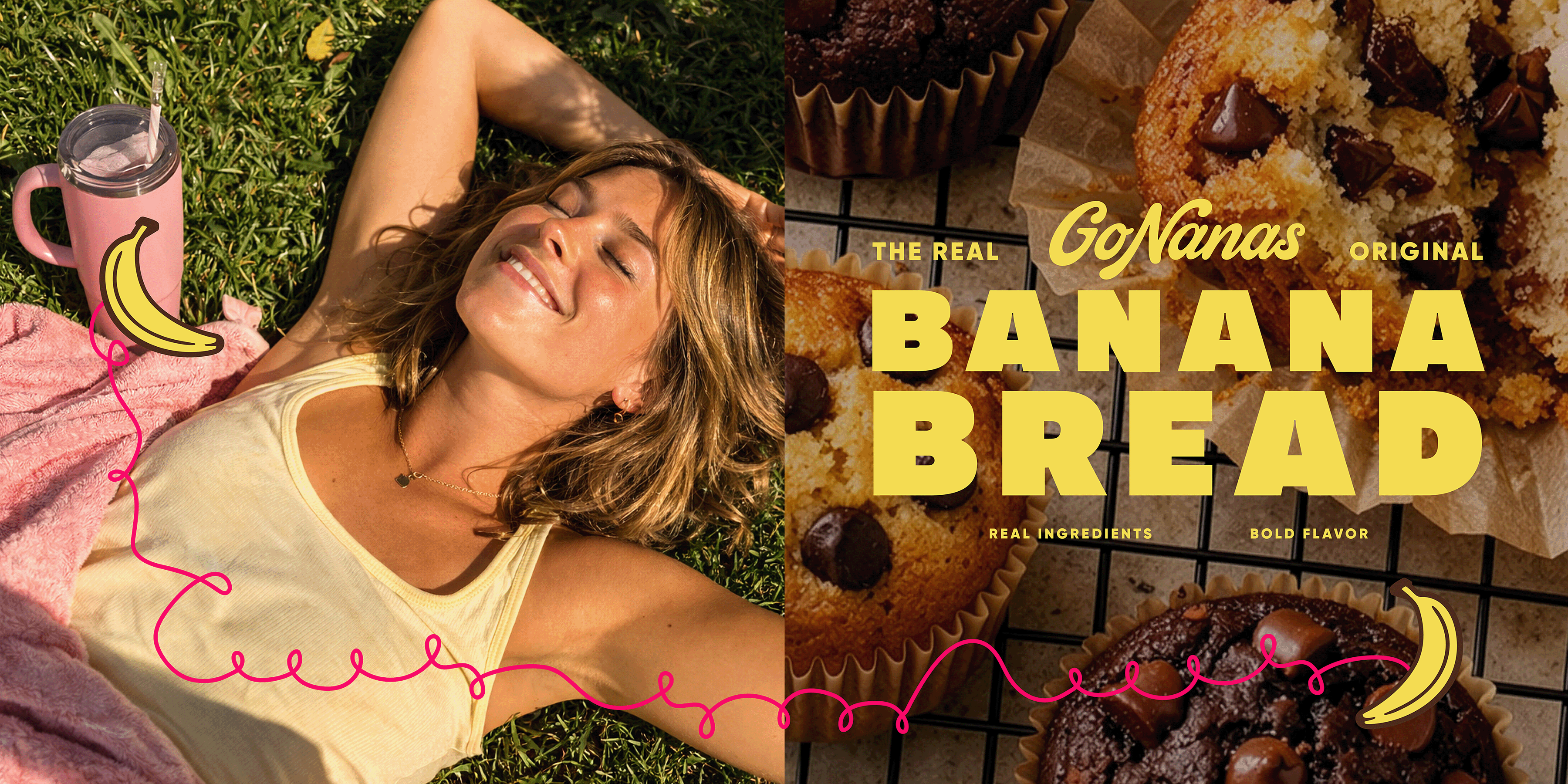
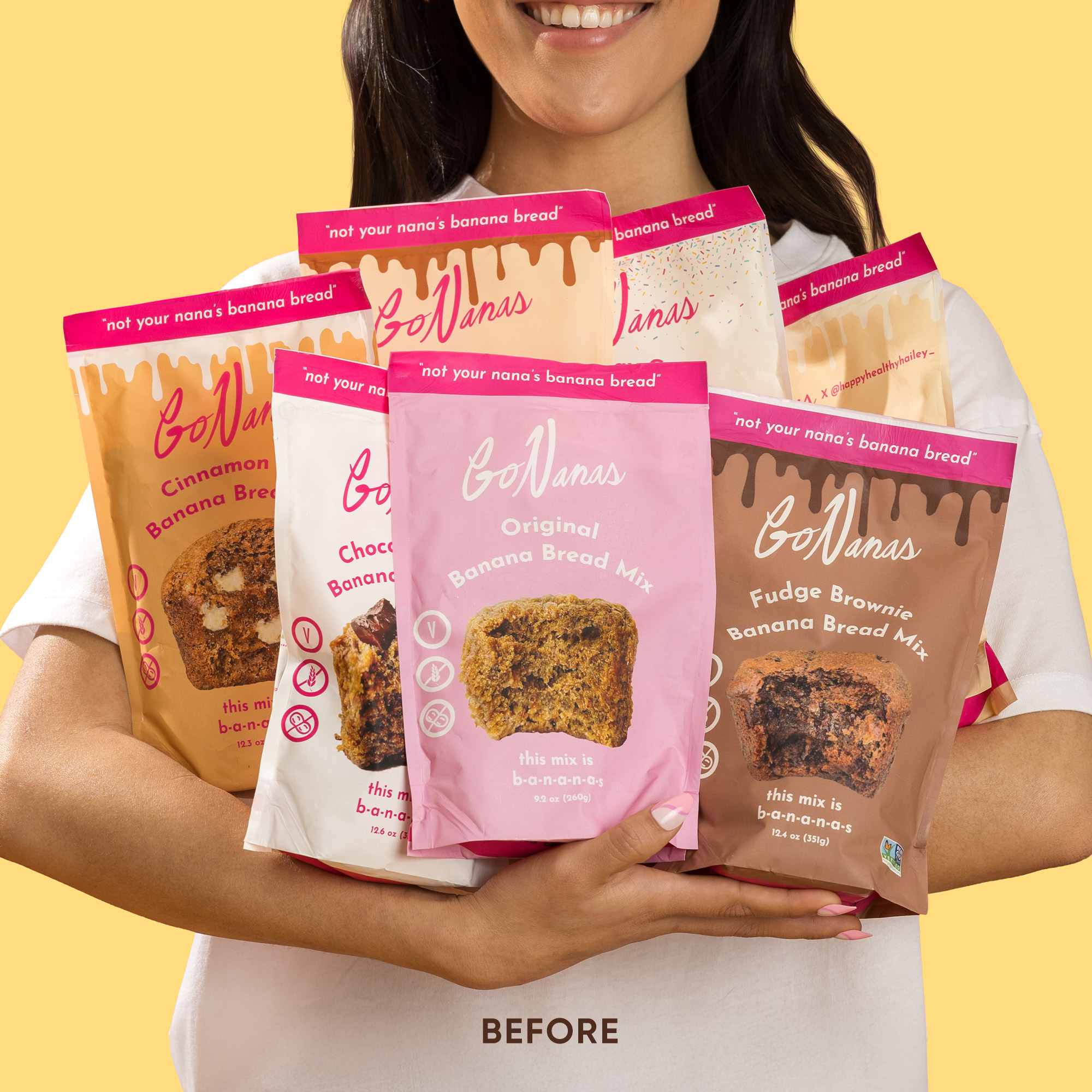
In the traditional world of baking mixes — long ruled by legacy brands — signs of innovation are finally starting to rise. The two banana bosses behind GoNanas saw an opportunity for their upstart brand to help lead a baking revival. They had exactly what new generations of home bakers were looking for: a better-for-you mix, a distinctive bake-with-fruit proposition, and the homemade taste often missing from boxed mixes.
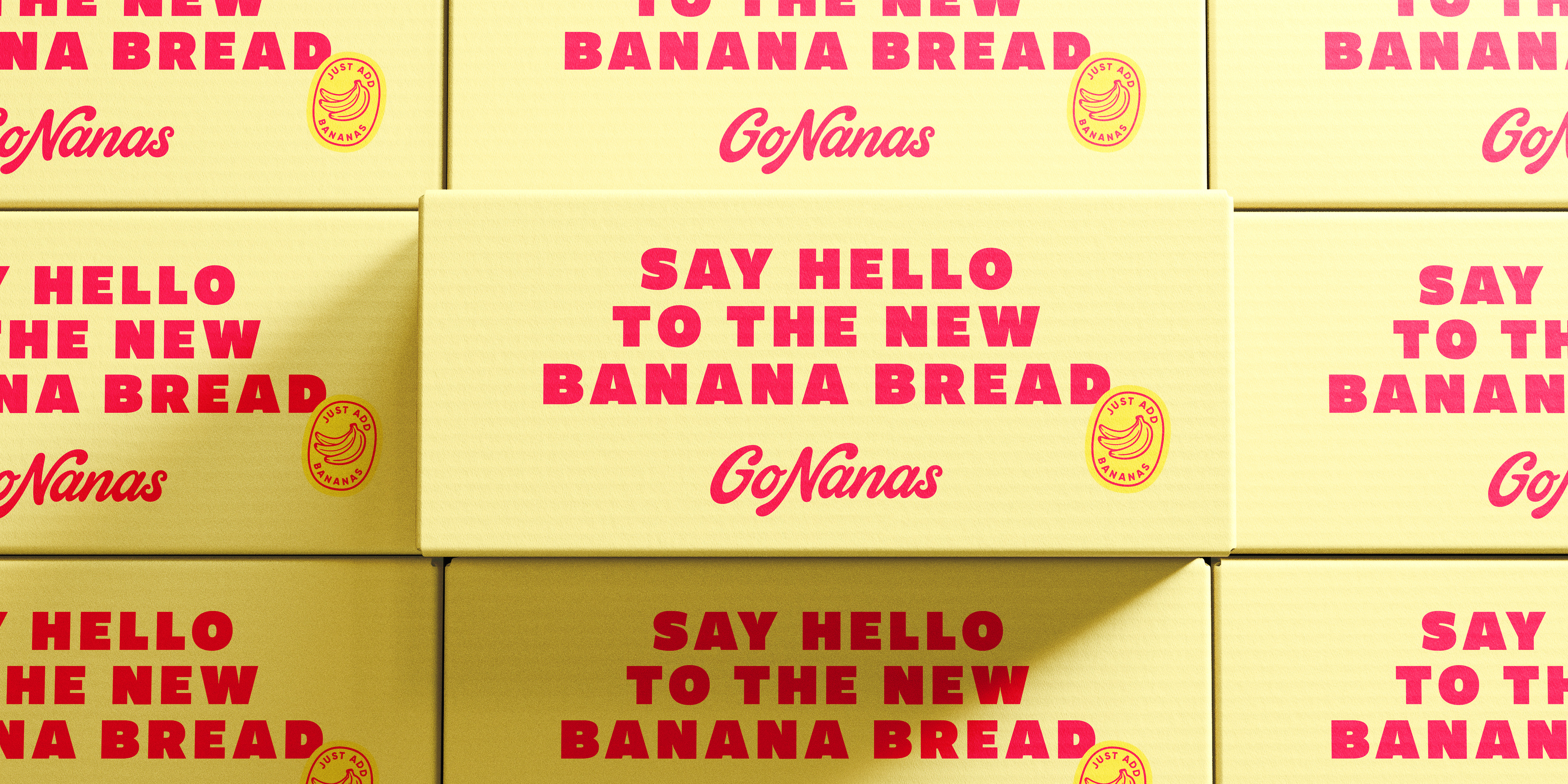
Despite early success, they recognized the need for a brand refresh to truly break through, sharpen their story, and seize the moment. Our job was to help GoNanas pay off their positioning on pack, create a can’t-miss beacon in the aisle, and turn up the volume on their vibrant personality.
Work
Identity, Packaging
CREATING A POWERFUL MIX
With nothing fundamentally broken, the creative strategy focused on maximizing opportunity. What would make GoNanas truly memorable? How could we signal something new and modern, while still feeling wholesome and nostalgic? And how might we make the natural goodness of the banana proposition clearer at shelf?
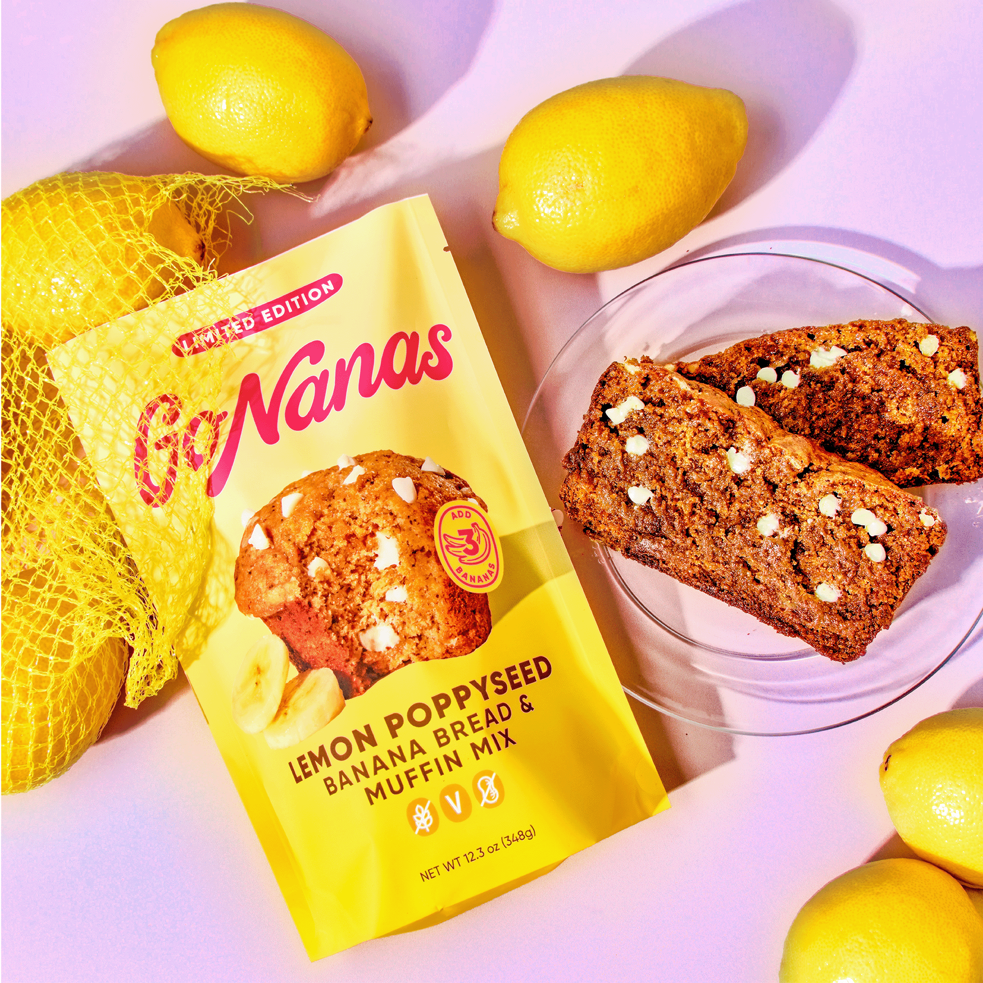
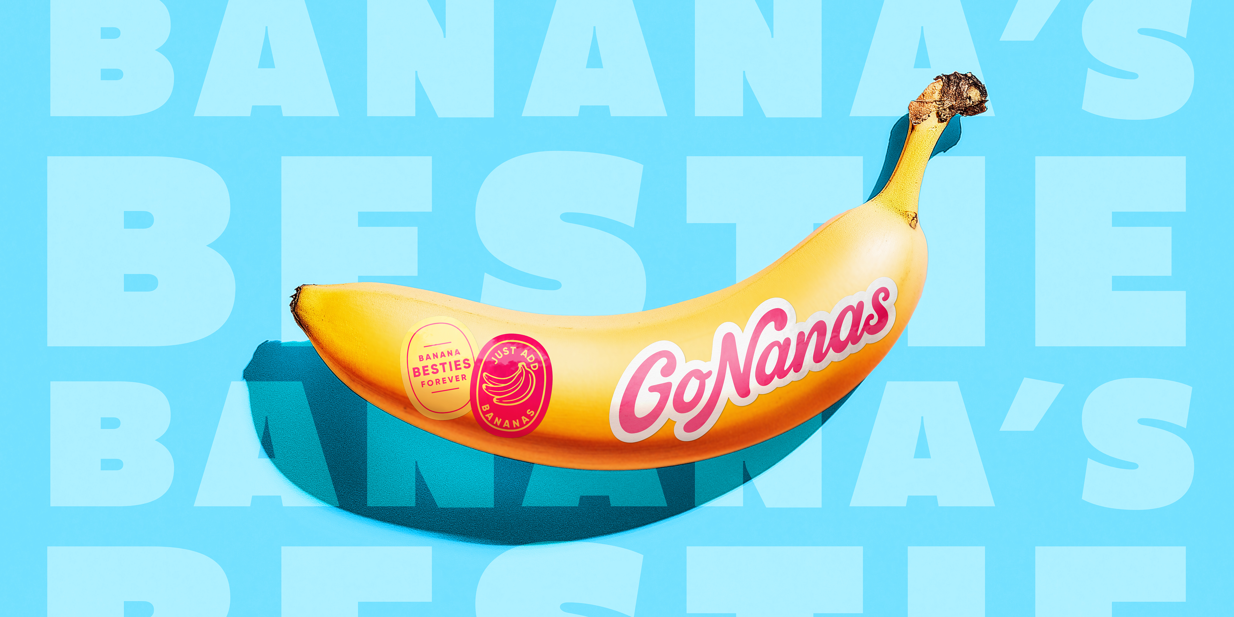
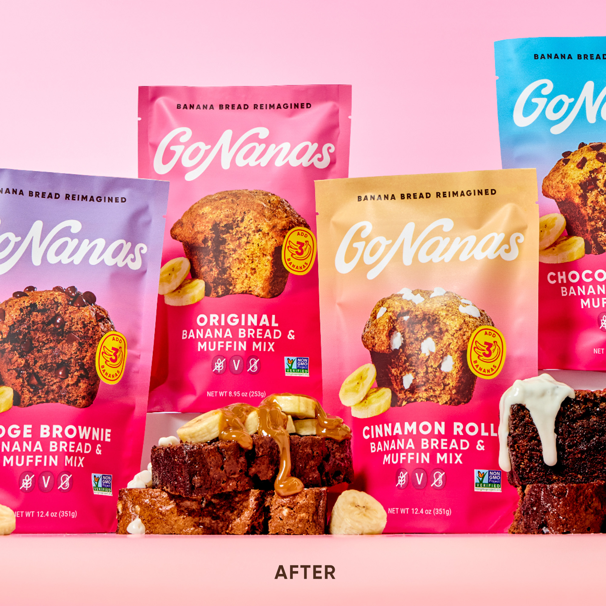
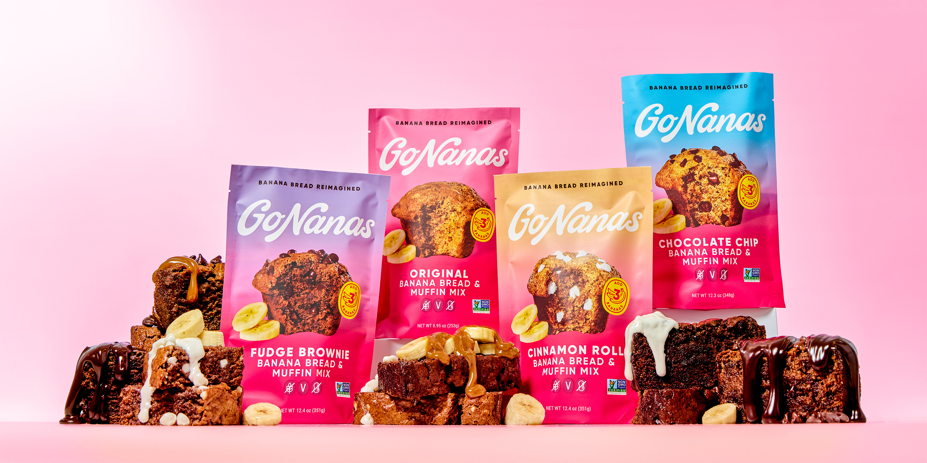
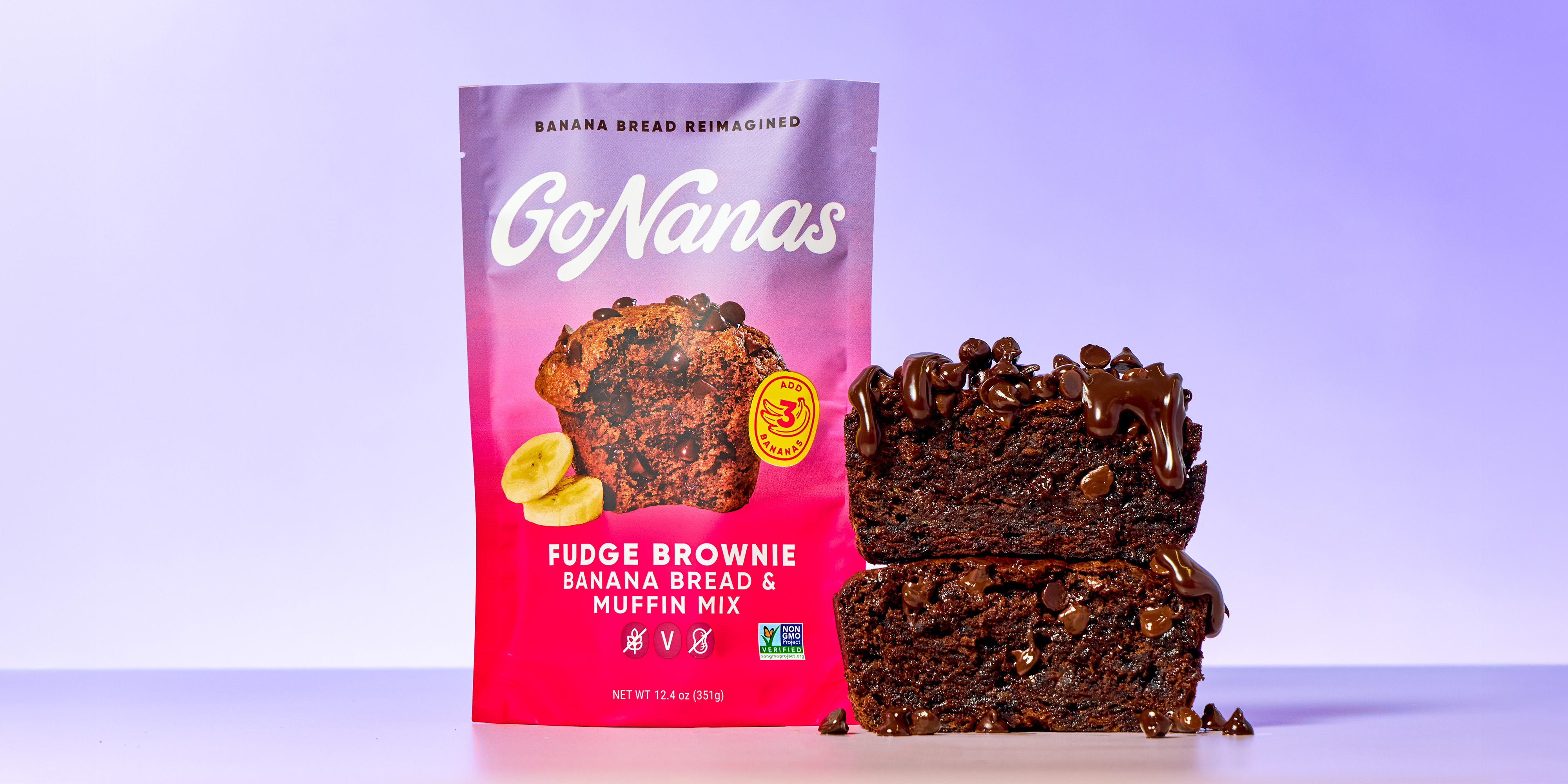
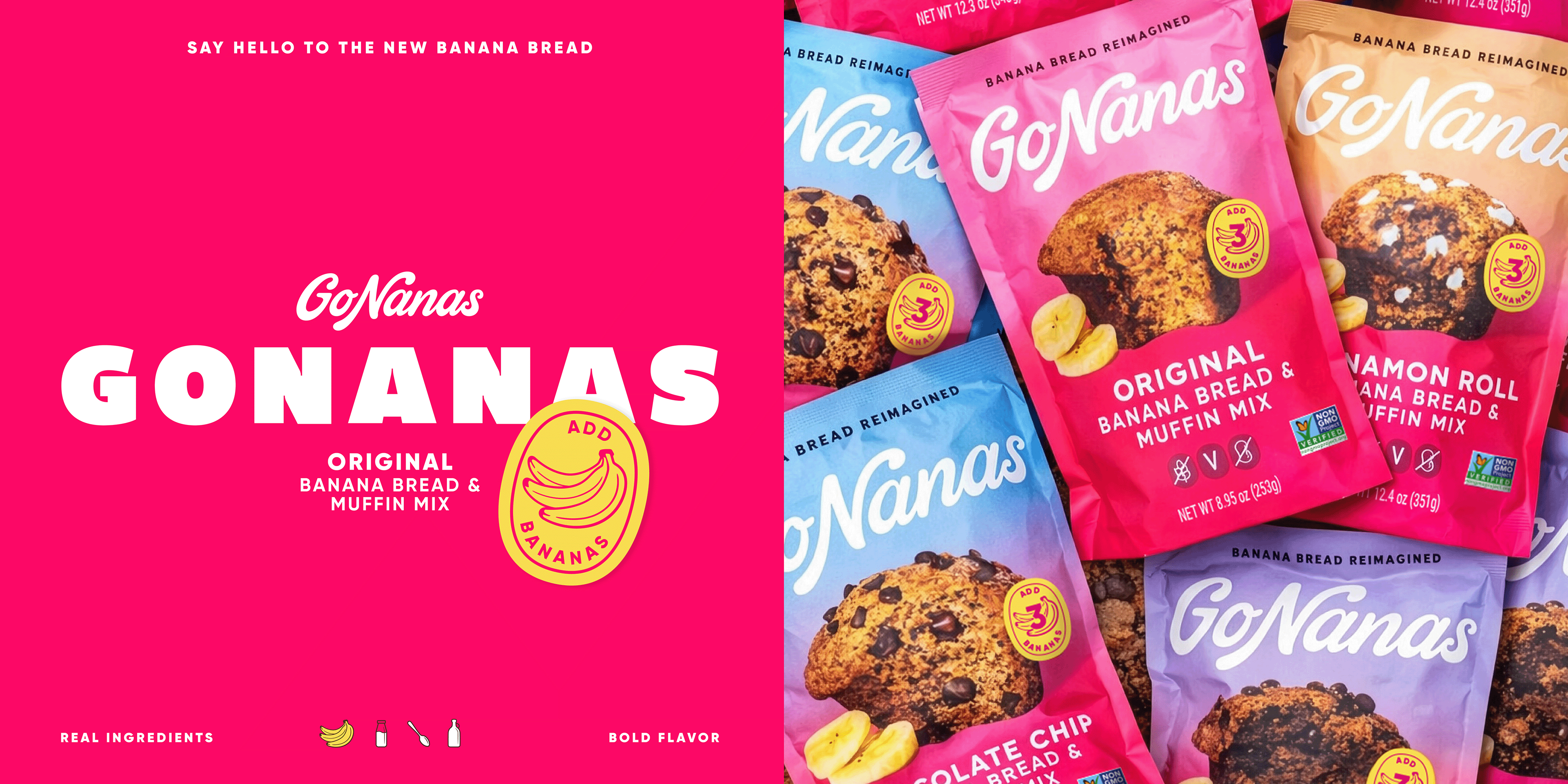
The existing portfolio relied on a shop-by-flavor color system that tended to fade away. We explored a range of colors GoNanas could credibly own, from better-for-you neutrals that cued naturalness to a hot pink that couldn’t be ignored. We modernized the wordmark to feel more delicious and impactful, and looked to the world of fruit stickers to make the product proposition callout an integral part of the story.
BREAKING THE MOLD
To validate our strategic choices, we held a research bake-off between the current and new designs and the results literally broke the Designalytics model — our leading design finished in the top 2% all-time. The pink masterbrand system, refreshed wordmark, and inviting flavor cues overwhelmingly beat the existing design for purchase intent, appetite appeal, and overall aesthetic.
The final design leads with pink for its stopping power in store, while the gradient nods to flavor mixing, helps shopability, and adds modernity. The result is a confident, craveable refresh that stands out on shelf and scales across the portfolio. Backed by standout design and breakout research results, GoNanas is ready to claim its place as the new icon of modern baking.