Date
2024-2025
Client
Wild Planet
Wild Planet
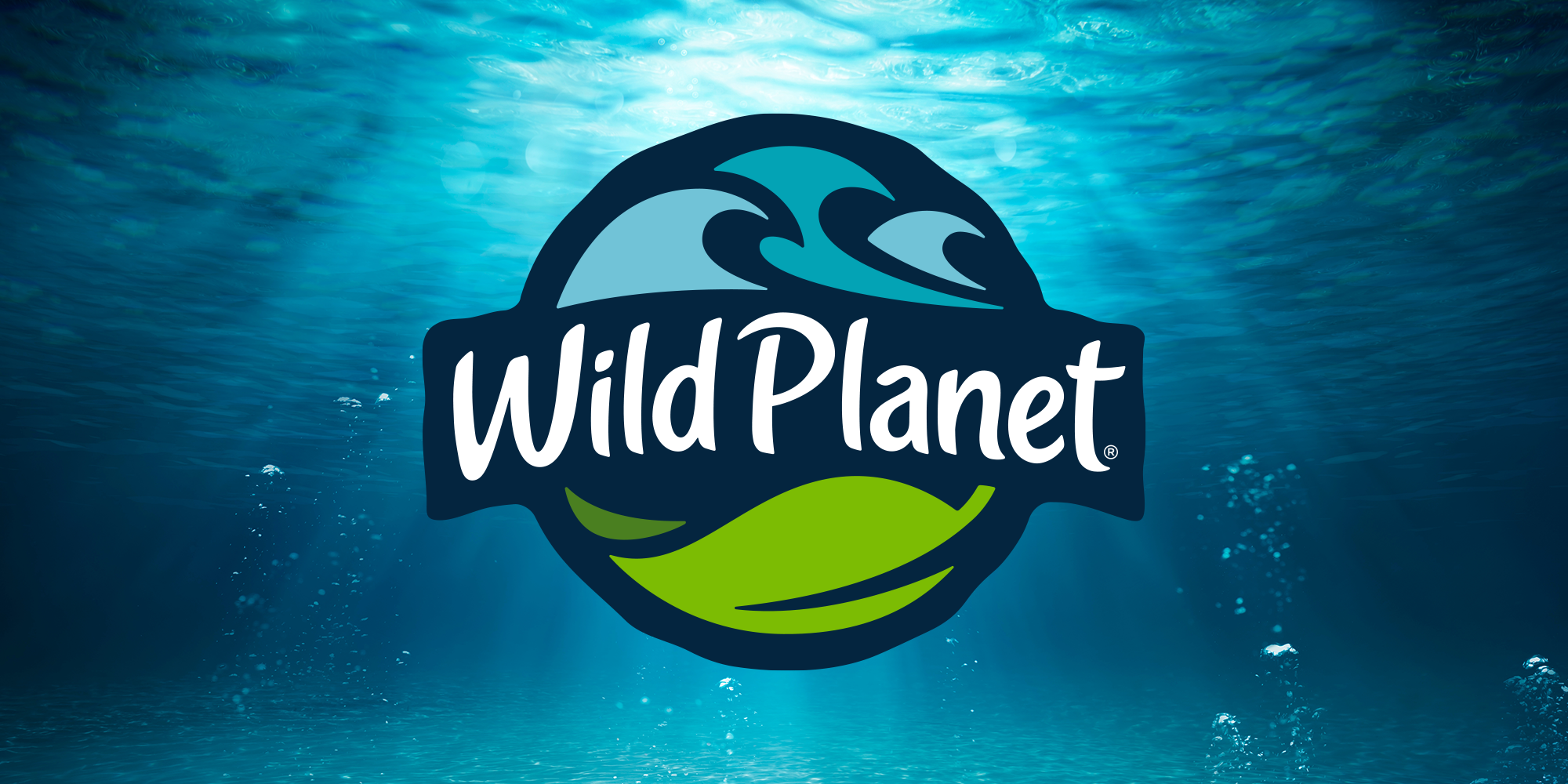
FINDING THE WILD.
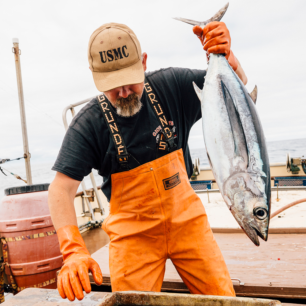
Wild Planet is a leader in the sustainable seafood movement, but their brand identity and presence at shelf was getting overshadowed by new players and squeezed by legacy brands. They were simply not getting credit for their full story, and not showing the wild side that has made them such a force for protecting the oceans.
Our job was to help Wild Planet stand out in a sea of new competition, and to bring out more of their wild side.
Work
Identity, Packaging
CASTING FOR CLARITY.
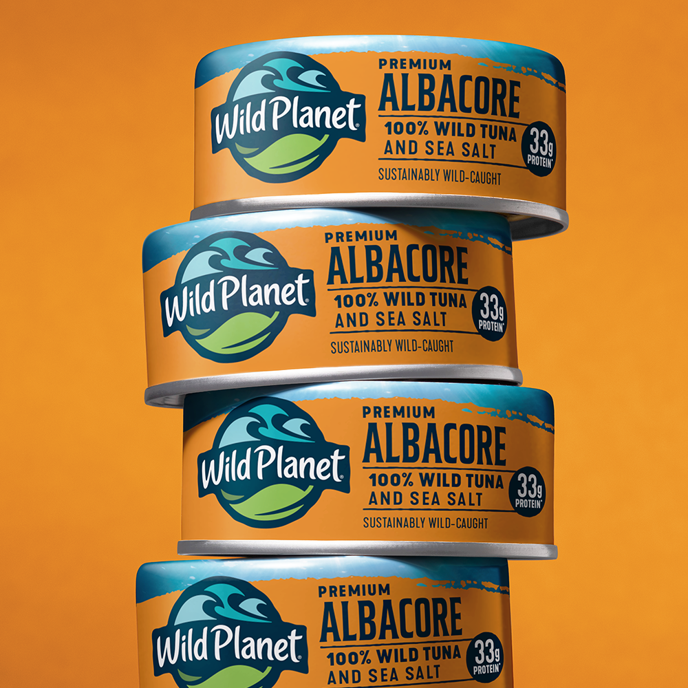
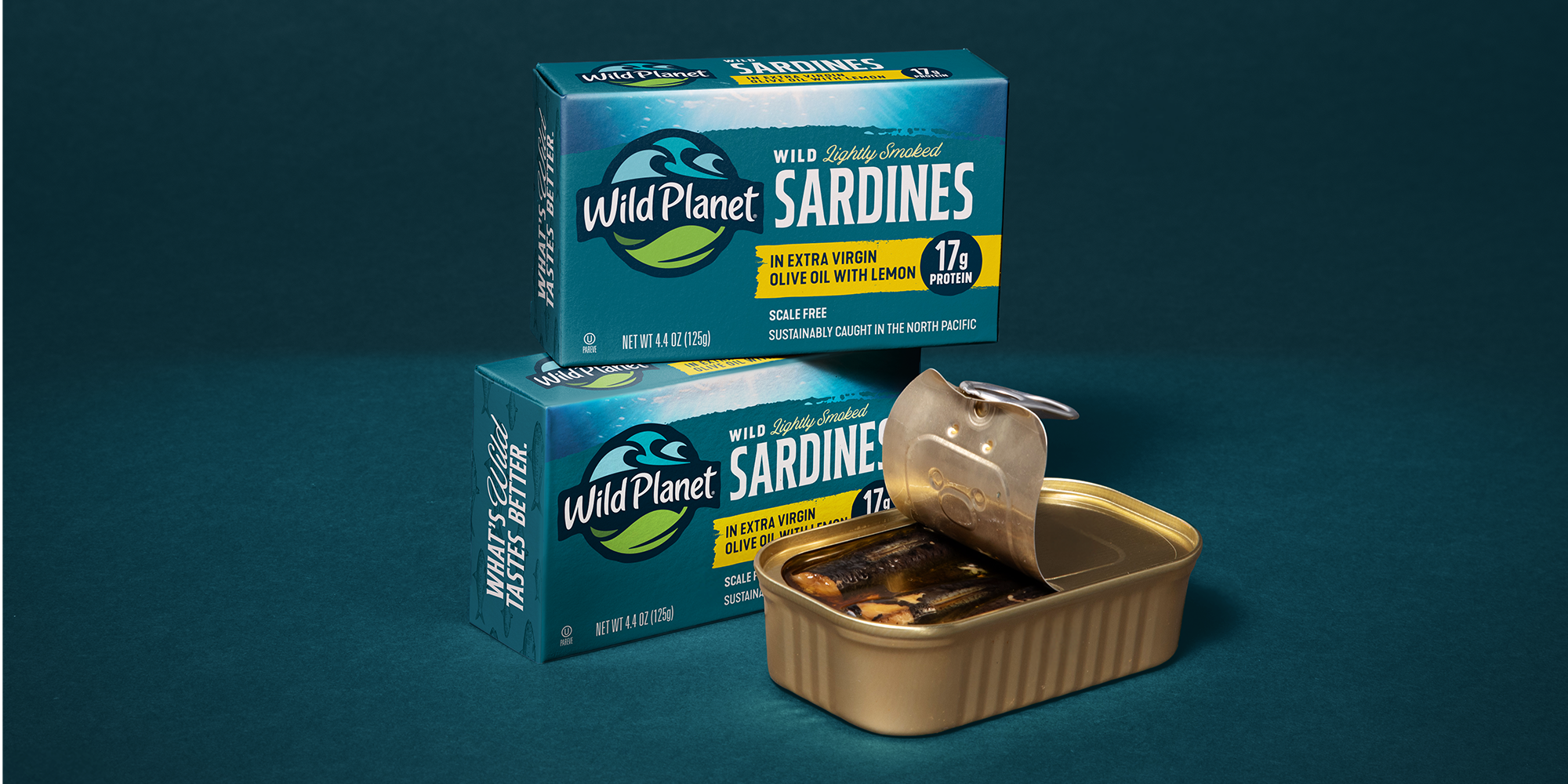
Our identity work included a full exploration between evolution and revolution. We wanted to find the edge in typography, color, hierarchy and iconography. We asked a lot of questions through the design process — how modern can we get? How wild is too wild? How much change is right for a familiar and successful brand? Ultimately, protecting what was working for Wild Planet was the right strategic choice. We modernized the type for legibility on the shelf, updated the icon to clarify Wild Planet’s land and sea point of view, and brought out a color system across the portfolio that reminded us of weathered boat houses or pole-and-line fishing fleets out on the open water.
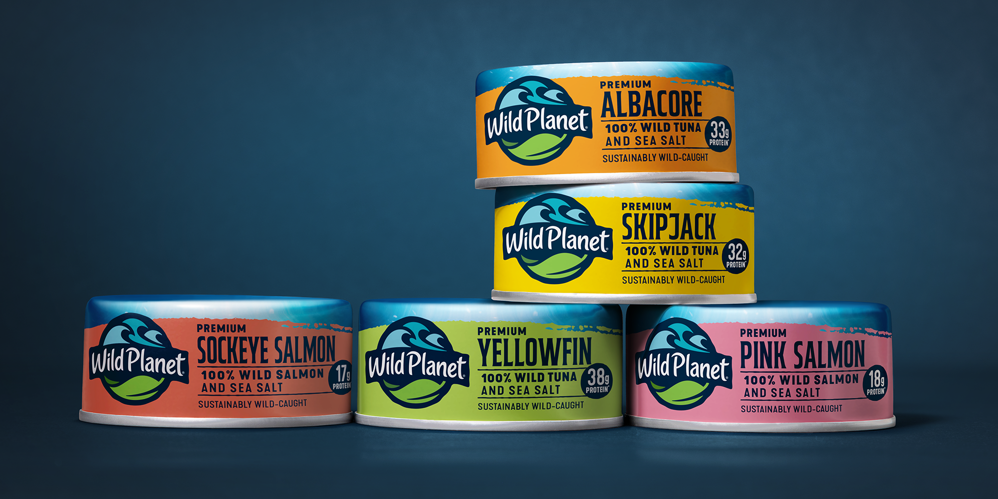
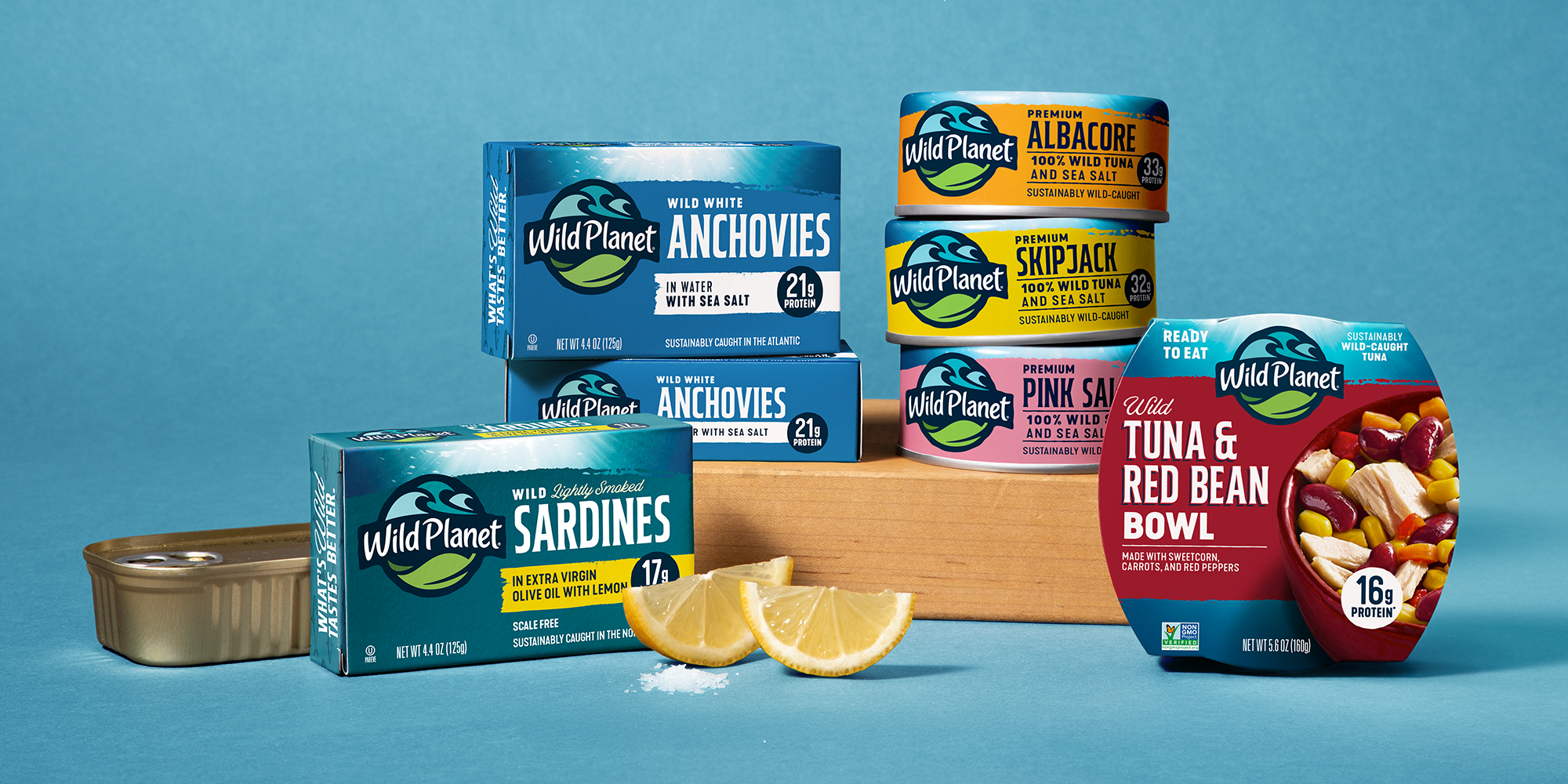
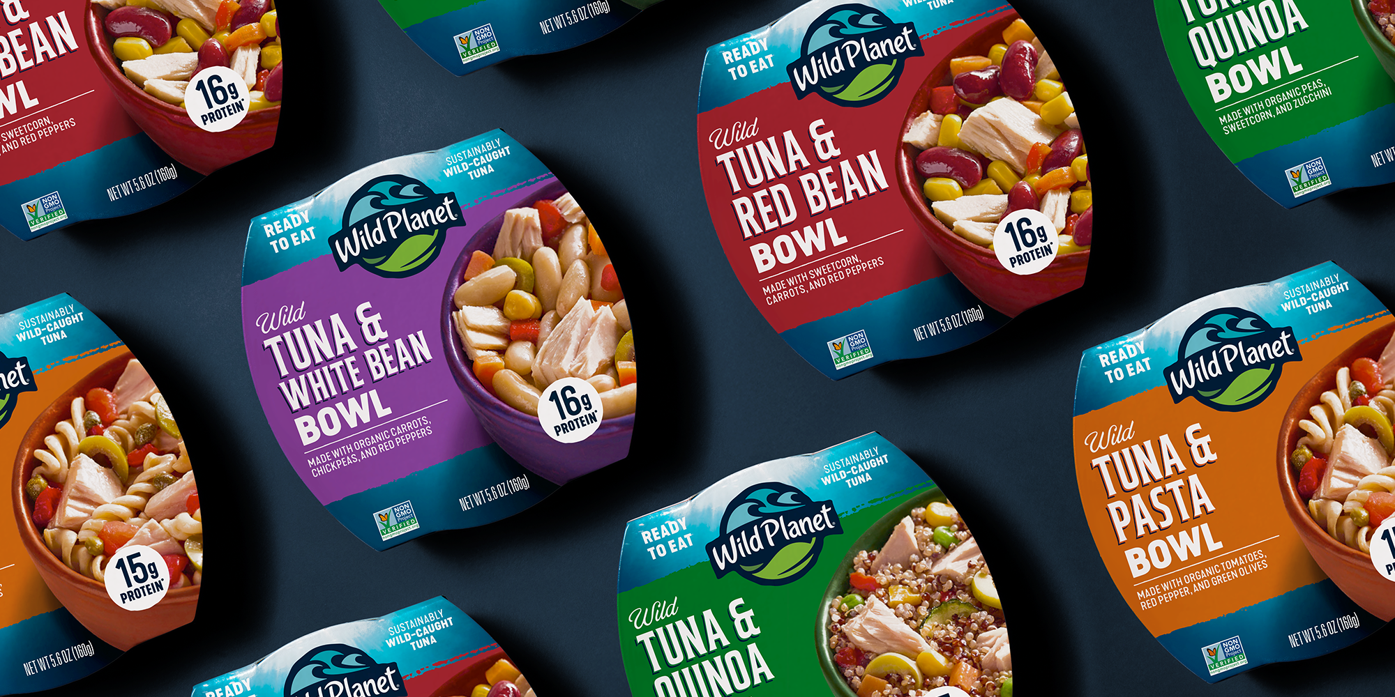
GOING DEEPER.
As we built the system across the Wild Planet portfolio, we went deep on details to pull some elements above the fray, while cleaning up others to drive a cleaner, more focused presentation. We kept the ocean-filtered light as a beacon of optimism and symbol of the ocean’s depth. And organizing the type, color and communication all led to a more powerful presence.
Bringing out natural elements, colors and shapes all helped Wild Planet get closer to their wilder side, and helped them find the confidence to step forward as the ocean-first leader they have always been.
.png)
.png)


